 +1 (212) 901 8616
 +91-880-044-0643


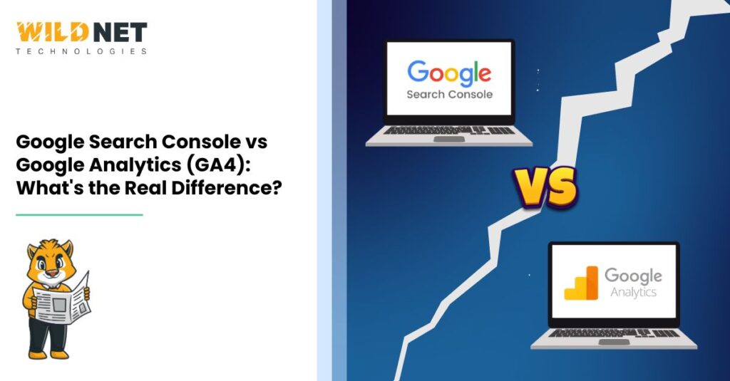
Google Search Console vs Google Analytics (GA4) is not a battle; rather, it’s a strategic partnership. GSC is built for…Read More
8 Mins read|Jul 01, 2025
Google Search Console vs Google Analytics (GA4) is not a battle; rather, it’s a strategic partnership. GSC is built for…Read More
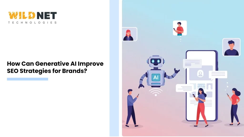
Generative AI is changing the digital marketing landscape. It offers new ways to enhance brands’ SEO strategies. This technology can…Read More

In today’s digital age, visibility is key to online success. Websites need to stand out in a crowded internet space….Read More
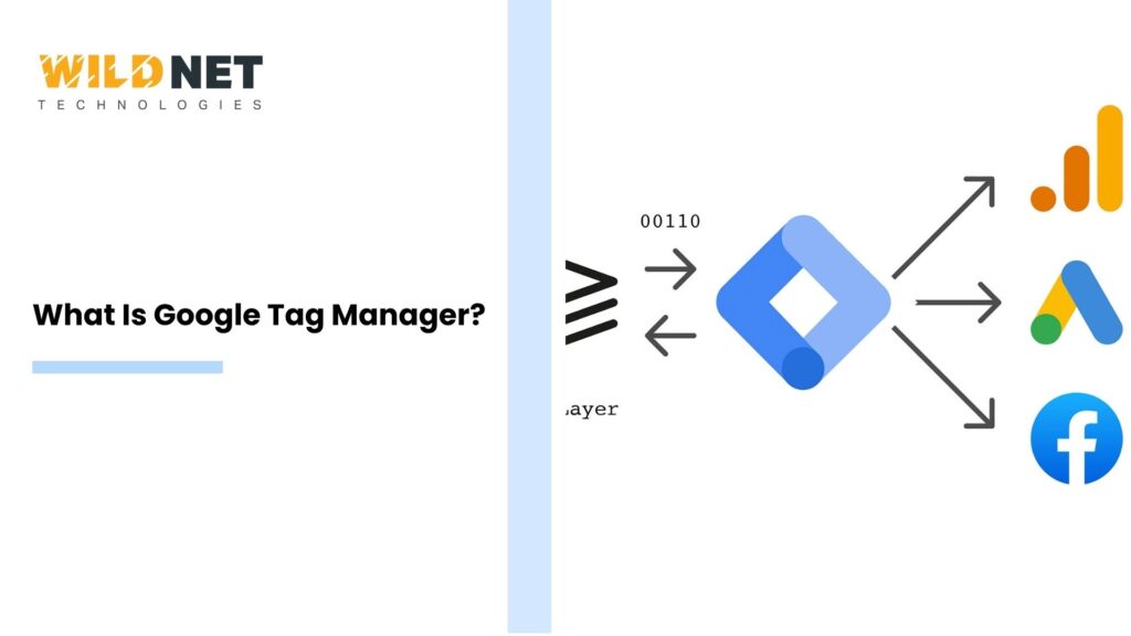
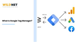
Google Tag Manager (GTM) is a powerful tool for digital marketers. It simplifies the process of managing marketing tags on…Read More
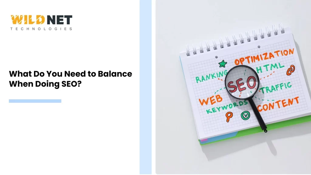
Search engine optimization (SEO) is a complex field. It requires balancing multiple elements to achieve success. Understanding what to balance…Read More

Understanding and responding to target customer needs is vital for any business. It is the cornerstone of customer satisfaction and…Read More

Finding low competition keywords is crucial for effective SEO. These keywords are easier to rank for and can boost your…Read More

Search Engine Optimization, or SEO, is a vital tool for online success. It helps websites rank higher in search results,…Read More

Driving organic traffic to a website is essential for growth. It ensures long-term success without relying on paid ads. Organic…Read More
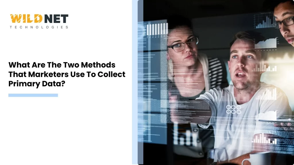
Understanding consumer behavior is crucial in today’s competitive market. Marketers rely on primary data collection methods to gather firsthand insights,…Read More
If you have a business challenge to solve or wish to take your brand to the next level, we would love to hear from you!

Wildnet's SEO services helped our website rank higher, bringing in more customers. Simple, effective, and worth every penny. Highly recommended for solid results.
-Pragya Burman
CEO
Need skilled remote developers or marketers on contract? Hire from us and get your team set up within 48 hours. From tech talent to marketing experts, we've got you covered. Book a call today to get started!